
Microcopy
nounUsed by professional writers to refer to short but crucial snippets of writing, set aside from the copy (the main body of text). Used on menus, buttons, forms and widgets etc.
plural: microcopy
etymology:
micro- + copy (from the Latin root copia meaning plenty)
If you’re short of time, you’ll get my drift by scrolling down to see screen shot examples of microcopy. Click on the graphics to visit the original sites. For those able to linger, this longread post celebrates thoughtfully composed microcopy, mostly found here on WordPress.
Why use microcopy?
Microcopy is a modern day telegram: we use it to pass on useful messages to our readers in the least words. Partly we’re forced to be concise by space constraints, but we also know the more words we write, the less likely people are to read them. And we usually want microcopy to stand out enough to be read, for example:
- Follow this blog
- Leave a comment
- Read my previous post
- Buy this book
- Follow me on social media
- Contact me
- Read more
Two of my passions come together in my admiration for great microcopy – language and marketing. It’s an overlooked art form: a fun way to finesse your blog – but there’s a serious side too.
The weird thing about microcopy
Marketeers carrying out tests to optimise blogs and websites quickly realized that microcopy matters. Minor changes to snippets of text in certain places often had a disproportionately large effect on whether people visiting the site took action and lingered, or bounced off the page without interacting at all.
The phrases tested might appear synonymous (e.g. more information, read more, find out more, see all…) but some just seemed to work better than others. If you search for ‘microcopy A/B tests’ online you’ll find more theories and case studies than you’ll care to read.
As so often when it comes to marketing, there’s no real mystery – and no absolute right and wrong. Experts agree that microcopy is most effective when people who read it understand what to do, feel safe doing it and can relate to the tone of voice used.
For example, I appreciate the courtesy of Aikanti©k’s search box heading. It’s a tiny tweak, but it works:

My own seems offhand by comparison. I’ll have to think about that.
Five rules of microcopy
- Be clear and concise.
- Engage, reassure and help.
- Context matters.
- Keep it in character.
- Test it on people who are not familiar with your site.
Having fun with microcopy
Without contextual clues, you might not guess what these widget titles mean:
- Wot’s all this then?
- So I says to Mabel, I says…
- Sort it out for yourself.
- These posts aren’t old, they’re distinguished.
- I’m friendly. Really.
- You have already been assimilated.
They’re creative ways to say ‘About’, ‘Recent posts’, ‘Search by category’, ‘Search by month’, ‘Follow me on social media’ and ‘You’re following this blog’.

The style is confident, quirky and entertaining, reflecting that of their author, Michelle Weber, the all-round good person many bloggers will have met in BloggingU courses. She assumes we’ll be bright enough to work out what she means from the context and if we don’t, she’s not going to lose much sleep over it. Stamping her character on her personal blog matters more. She’s showing us what’s possible – and not taking herself too seriously.
Michelle isn’t afraid to break the odd rule, and we shouldn’t be either. By trying out a few ideas, keeping an eye on the stats (and being prepared to go back to what we had before) we’ll build up instincts for what works for us and what doesn’t.
Microcopy for purists
Some of my favourite microcopy is almost invisible: as in any form of applied art, the most elegant creative solution is often the simplest. When Michelle creates copy for WordPress, like all the other editors, she’ll take pains to make sure we all know exactly what’s what. I’ve no idea who created this call to action, but it’s characteristically clear and straightforward:

The options on this TED Talks menu are mainly active verbs. They ask their readers ‘what do you want to do today?’ inviting interaction in ways we might not have considered:

A bit of extra microcopy on the other side of the header adds more facts and extra character:

Default microcopy
Professional sites have more resources than private bloggers to test and refine microcopy. Luckily, WordPress and theme developers have built in default phrases for bloggers to use. ‘Leave a Reply’ for example. In many cases we can go into our dashboards or use HTML to overwrite it. Just because we can doesn’t mean we should. The default settings will work fine. Anything else involves taking a calculated risk.
Only you can decide where your priorities lie. If you like to take every opportunity to be creative or you feel it’s time to layer on some branding, microcopy offers a great opportunity to be different. Here’s photographer Lignum Draco’s comment box:
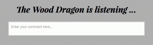
He hasn’t gone too wild: ‘Enter your comment here’ in the box below reassures us this is an otherwise standard comments form.
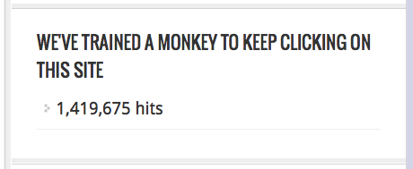
It makes sense to save our most cryptic moments for areas of the site where nothing is lost if visitors don’t quite get it, such as this self-depreciating page view count heading from News Toad:
Social media
When your microcopy is shown beside well-recognised social media symbols, there’s little lost by infusing your microcopy with character as Impossiblebebong has done here:

After all, those who don’t recognize the Twitter logo probably don’t use Twitter. I also like the simplicity of this, from Peonies and Posies:

And here’s Infinite Belly doing much the same thing in words, taking the opportunity to explain what we’ll find on Smugmug as we may not have heard of the site:

Where microcopy matters most
If you’re keen to recruit more followers, don’t go wild with the subscription form text. Would you leave your e-mail address in a field titled: ‘Fall down the fox hole’? Would you even be sure what you were signing up for?
Rusty Duck has tweaked the default microcopy here to reassure potential followers that their data won’t be misused. That’s nice to know. She also reminds WordPress users they can choose to follow in the Reader or via email by changing their delivery settings:

For Longreads, this is probably the most important wording on their site. It’s in prime position (top right) and it explains the ethical and practical benefits of membership. The copy is clear and personal (we’ve…you’ll):

I hope it works for them. Danny Gregory could have titled his widget ‘Buy My Book’ but he sidestepped the standard wording to convey more excitement. We missed pre-ordering! No harm done:

If he’s got time to keep on top of details, sooner or later there will be new words in the flash – hopefully ‘Best Seller’!
Satisfying expectations
If we’re idly browsing online, we might not mind a few wild goose chases. We might even click on ‘Don’t click on this’. But we probably won’t. We need a good reason to visit another page rather than stay where we are or go back to where we came from, perhaps the Reader or Discover.
Discover is a fairly new talent showcase: a curated library of content. As in a dating agency, the editors want the right kinds of sparks to fly when they connect readers with writers. Using just a few words on a button, how do the editors help you identify the post you’ll enjoy most? They could just put ‘Read more…’ on them all, but they’re making the most of every little opportunity to explain our options and make sure each click counts for something:


Branding with microcopy
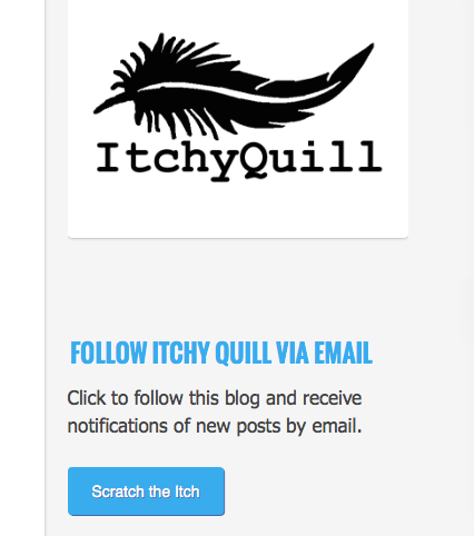
If you brand your site, or have a consistent personal style, microcopy is an opportunity to pile on extra character, as Itchy Quill has done here (see ‘Scratch the Itch’?). In the context, we know what it means. I love the feather logo – it has a look of eyelashes closed in a wink to me.
DesleyJane of Musings of A Frequently Flying Scientist has added an inviting touch of branding here too. The follower count gives us extra reassurance that ‘come fly with me’ is a way to follow her blog, not a literal invitation to travel.

Link Widget Titles
You’ve gone to the trouble of gathering together links to some websites you think your visitors might also enjoy. It’s well worth explaining why you’ve picked them. By telling us what makes these sites special, as David Higgerson has done here, you’ve a lot more chance of us visiting them:

If you’ve been intrigued enough to want to click on the links, click on the screen shot to visit David’s site then scroll down to the footer.
Microcopy as symbols
Modern web design has replaced some microcopy with symbols. Minimalist themes often hide access to widgets and menus behind three lines. Some readers will be missing out here. If your theme allows you, or you’re adept with HTML, adding a single word preserves the clean feel, but highlights the opportunity to find out more:

WordPress sometimes errs on the minimal side – there are clearly neatniks in positions of power – so access to useful features is often hidden away. If you see anything on the official WordPress pages (your dashboard, in the Reader, in forums or the Daily Post) you might as well click on it at least once to find out what it does. I’m talking about arrows, lines, dots… any subtle symbol most likely has a reason. For example, the grey v-shaped arrows in your stats all do something:


While a word of microcopy might appear as if it would help alert us to our options, how much do we expect writers to squeeze on one small button? And would we have any chance of taking it all in at a glance it if they did?
If it all sounds a bit worrying
It’s really not. Brands and businesses can gain a lot by taking a close look at their microcopy, but on our personal blogs, all that really matters is that we’re happy with the text we’re using. If the text header on your comments form is still just the default, you’re far from alone. And it’s designed to work.
If your personal style runs counter to everything I’ve highlighted here, remember, this is just my perspective. It wouldn’t do for us all to be the same. But anytime you’re squeezing a lot of words in a small space, or your meaning is opaque, take a moment for what my friend Jo calls a sanity check. Will anyone else get it? And does it matter to you whether or not they do?
I’ve shown you my favourite examples of creative microcopy: if you’ve got some, please share them!

Great article – thanks !
This is a great article. Lots of food for thought here. I am working on redesigning my site and have been thinking a lot about what’s in a name or label 🙂
Good luck with the redesign. I’ll be watching out for it!
It’s already in progress 🙂 No need to wait.
I see now. That’s a lot different. I really like it (even though I have a thing about snakes).
I don’t like them either! Just photoshoping them for that post gave me the chills!
Lots to think about, and I’ll be thinking about how this can be applied to my blog. Thanks for such an informative piece.
You’ll probably start to spot lots of examples now – some you’ll like, others you might not!
Yes, I’ll be looking.
Interesting post Susan, with lots to think about and try to understand. Thanks for posting this.
I’m glad you enjoyed it.
Written like a pro – great article, Susan!
Thanks, Eliza.
Oh I love this post (and thanks for noticing my little follow button 😉). I love this stuff too, marketing is one of my favourite things about my job, even though I only get to help out the real marketing guy sometimes. I agree that it adds some personality, even though WP does have some cute bits already programmed in. Thanks for sharing this, loved it.
I was hoping you wouldn’t mind a call out!
Not at all, love it.
This is a really interesting post Susan. Thanks for sharing all this information in such a readable way.
I’m glad you found it readable. There’s an irony in writing a long-read post about microcopy.
A delicious irony 🙂