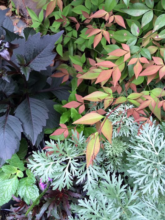
Gorgeous contrasting colours in the first photo, it’s beautiful 🙂
Thanks Eunice. They’re all interesting departures from green.
I’m with Eunice. The contrasting colors in the first photo are beautiful.
I’ve a feeling this was taken on a garden centre’s bench of plants. I found it in my files when I was doing a bit of spring, er… very late summer cleaning.
Delightful images – well seen and presented.
Thanks, Louis. I think we both share a love of colour and pattern.
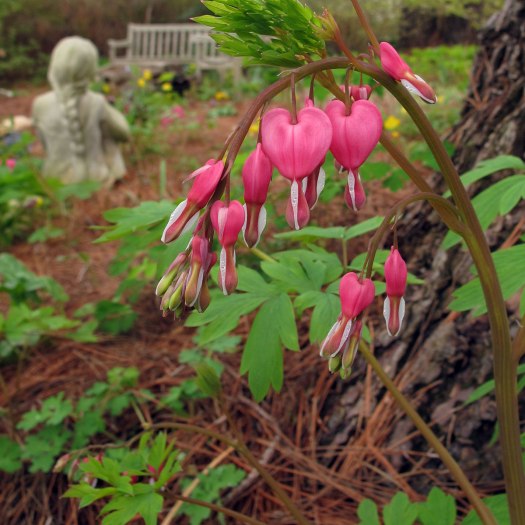
I love them both. Lots of textures and interest in the 2nd photo that draw me in and keep me there! ❤
I’m glad to hear it. One contrast or echo that interests me in the second picture is the drooping arc of flowers seen against the statue’s stone plait.
I like the way the leaves seem to point to each other in that first one. To my eye, the melancholy in the second photo pulls everything together and contrast is hard to see; it’s quite a touching image.
I suppose it is a more obscure contrast in the second image – the living stem of dicentra flowers seems to reflect and contrast with the stone plait… even the way the flowers dwindle to buds and the plait becomes thinner. But, as you know, I have a strange kind of eye for this.
It is a little melancholy – the stone girl seems reflective and the folk name for the flower is bleeding heart.
It’s a subtle and beautiful contrast, and you definitely caught it better than I did. I think what hit me was the contrast between foreground and background: bleeding heart to empty bench, bright color to ghostly grey, soft lines to hard lines, with the child’s expectant posture toward the emptiness. Contrast between absence and presence, perhaps. There is something about what seems to be some kind of pine needle mulch that seems to make it all one. As you can tell, this kind of image is all about mulling. Is this blessing or curse?
You show me that all the elements you see are there. There’s an underlying contrast in the apparent life of the stone too that all figurative sculpture shares.
It was a lovely woodland garden without the pensive feel the picture has, although woodland always has a shady side.
A blessing or a curse? Potentially both. We mullers have a responsibility to ourselves to keep our toes on the blessings side… or to heave them back if they stray.
Wow, that first combination of textures/colours is so beautiful!
I mentioned to Laurie that I thought it was a garden centre, but it could easily be part of my sweetheart’s a/w planting cluster. He always has one and several of his favourites are there.
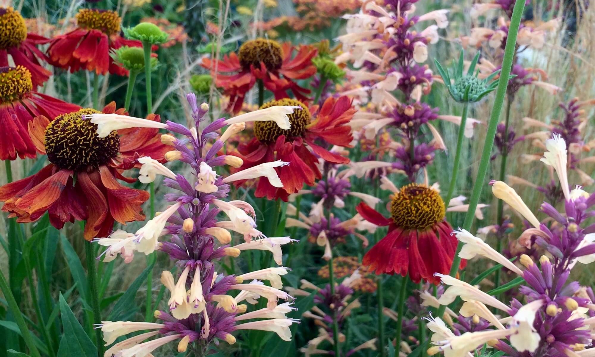
Oh that last photo is lovely …🙂
I’m glad you liked it. It’s a private garden that Brent Heath once took me to, not far from his nursery.

Gorgeous contrasting colours in the first photo, it’s beautiful 🙂
Thanks Eunice. They’re all interesting departures from green.
I’m with Eunice. The contrasting colors in the first photo are beautiful.
I’ve a feeling this was taken on a garden centre’s bench of plants. I found it in my files when I was doing a bit of spring, er… very late summer cleaning.
Delightful images – well seen and presented.
Thanks, Louis. I think we both share a love of colour and pattern.
I love them both. Lots of textures and interest in the 2nd photo that draw me in and keep me there! ❤
I’m glad to hear it. One contrast or echo that interests me in the second picture is the drooping arc of flowers seen against the statue’s stone plait.
I like the way the leaves seem to point to each other in that first one. To my eye, the melancholy in the second photo pulls everything together and contrast is hard to see; it’s quite a touching image.
I suppose it is a more obscure contrast in the second image – the living stem of dicentra flowers seems to reflect and contrast with the stone plait… even the way the flowers dwindle to buds and the plait becomes thinner. But, as you know, I have a strange kind of eye for this.
It is a little melancholy – the stone girl seems reflective and the folk name for the flower is bleeding heart.
It’s a subtle and beautiful contrast, and you definitely caught it better than I did. I think what hit me was the contrast between foreground and background: bleeding heart to empty bench, bright color to ghostly grey, soft lines to hard lines, with the child’s expectant posture toward the emptiness. Contrast between absence and presence, perhaps. There is something about what seems to be some kind of pine needle mulch that seems to make it all one. As you can tell, this kind of image is all about mulling. Is this blessing or curse?
You show me that all the elements you see are there. There’s an underlying contrast in the apparent life of the stone too that all figurative sculpture shares.
It was a lovely woodland garden without the pensive feel the picture has, although woodland always has a shady side.
A blessing or a curse? Potentially both. We mullers have a responsibility to ourselves to keep our toes on the blessings side… or to heave them back if they stray.
Wow, that first combination of textures/colours is so beautiful!
I mentioned to Laurie that I thought it was a garden centre, but it could easily be part of my sweetheart’s a/w planting cluster. He always has one and several of his favourites are there.
Oh that last photo is lovely …🙂
I’m glad you liked it. It’s a private garden that Brent Heath once took me to, not far from his nursery.