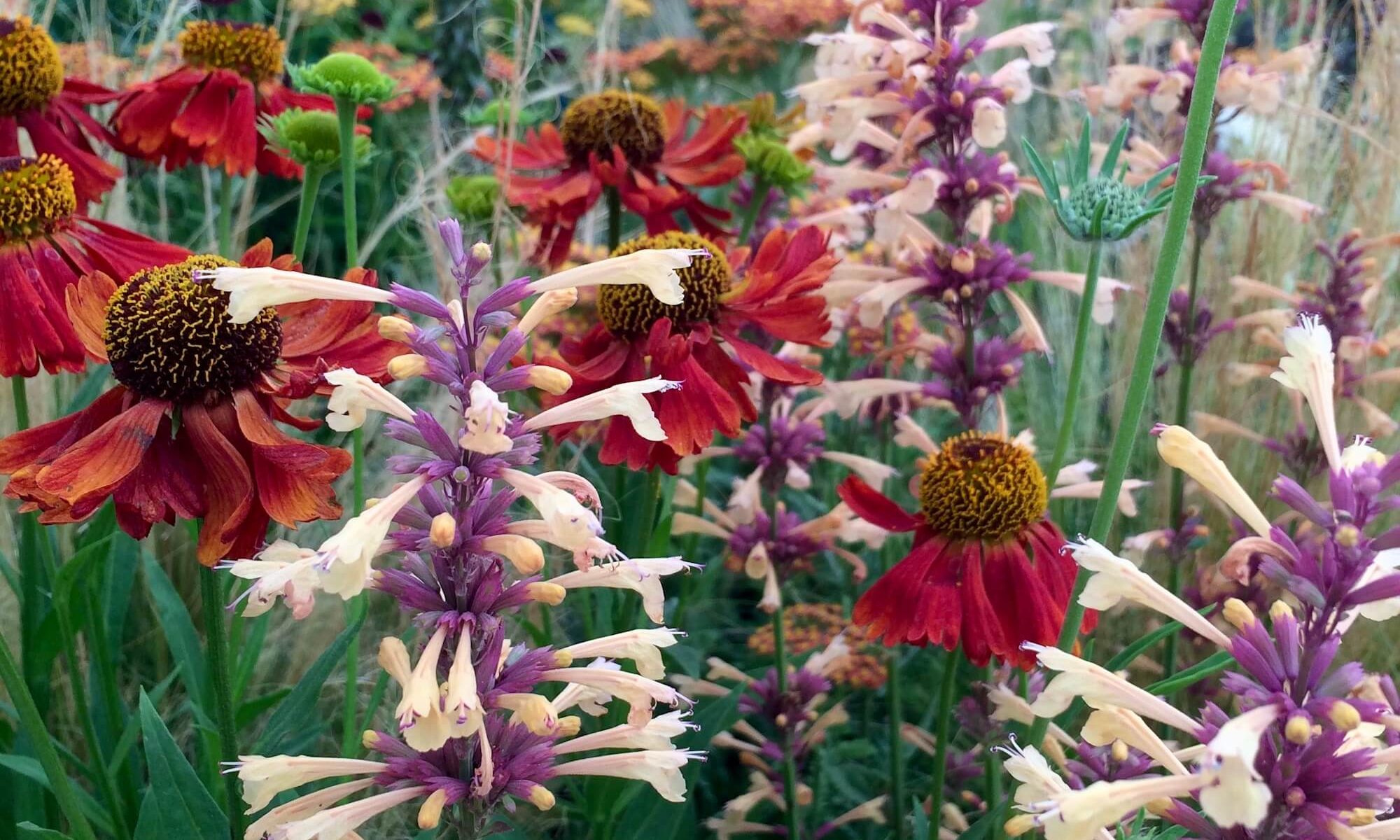
While visiting the flower shows this year, I was drawn to a colour thread represented by the flowers I’m showing here. I’d filed the pictures as Clarets thinking ‘Anyone for claret?’ would be a good post title, but reluctantly concluded that claret was stretching things too far…
though not quite so far as the liberties taken in naming this ‘New Vintage Violet’…
or this ‘Dark Angel Violet’. Plant names are a minefield at the best of times, even before you add colour into the mix.

The bold combination of the daylily against the dusky foliage of an adjacent plant was so striking, I completely forgot to note down the variety names, but it looks like another violet to me – dark violet perhaps (only teasing).
It’s easy to mock, but more tricky to put your finger on what would be better: Pinot Noir, raspberry, fuchsia, pale crimson, magenta, burgundy… I could imagine objections to all of these. Professional help was required. Pantone, famous for their colour expertise, would have a name for the colour of these gladioli:
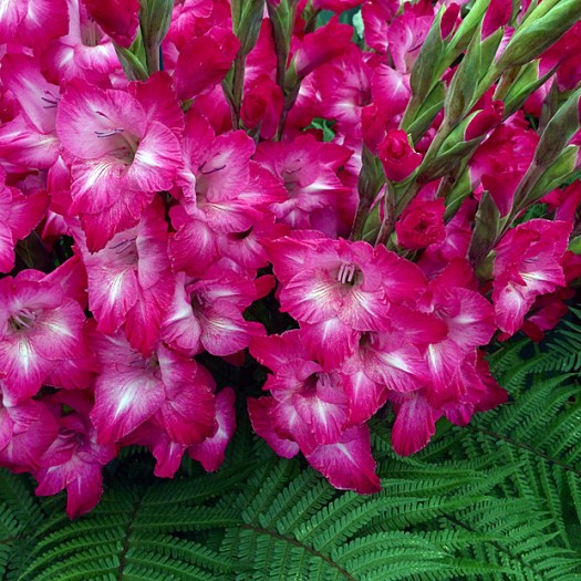
Problem solved. After consulting their site, I can confirm that, in the parlance of the day, these glads are Pink Peacock in hue. I don’t know if nature has given us any real pink peacocks, but Pantone asserts that the colour is tantalisingly theatrical, bold and experimental, and on trend.
Phew. I’ll leave you with a twist on the theme – a dahlia with pale upper petals as a beautiful contrast to their Pink Peacock reverses:
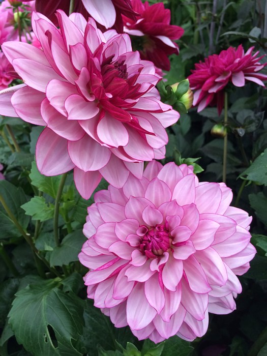
I love the picotee effect and the light waving or rippling of the petals that gives them a subtle light and shade effect.
So there you have it. A selection of perennials to create a modern twist on the classic red border.
We’ll soon start hearing about the colour Pantone has identified as the guiding light for designers during 2019. Assuming the corporate influences that gave us Pink Peacock will still be in play, I’m forecasting the colour of the year 2019 will be Unicorn. What do you think?

From reading your post I get the impression that even the experts in botany are being fooled by the incredible variations in colour and hue of our beloved flowers. From my experiments with digital photography I made the discovery that even the camera cannot capture the true colour of a flower. Thank you, Susan, for your lovely post!
That’s a very good point – or rather several good points. One of the reasons I switched to using an iPhone for photography is that the colour representation was more accurate than my ‘real’ camera.
I’ve often thought that some of the ornithologists naming birds must have been colour blind, especially in North America. I can see a Purple Finch as I type this, it’s raspberry red.
…and our robin redbreast is decidedly orange.
That’s true. I think that was explained in an episode of QI when there was no name for the colour orange.
I have been befuddled by some color and flower names, also. I am not aware of the existence of a pink peacock, but have heard of a pink panther. Ha.
Funny 🙂
How about “lovely” and leave it at that?
… or how about 4th book cover colour?
Believe it or not, that has been on my mind.
The colour reminds me of the fresh Raspberries I’ve got in my fridge at this very moment.
Pink Peacock is really stretching the imagination though. I thought peacocks were blues and greens.
Beautiful flower images, Susan….in composition, focus, light and colours.
Thanks, Vicki. I’m fairly sure the pink peacock images a google search throws up have all been digitally manipulated, but you never know. I’ve seen some strikingly coloured birds when travelling that I wouldn’t have believed if I’d just seen a picture of them.
The colour names may be misleading, but I love every picture you’ve posted here. I wonder how much of these glorious colours are due to hybridization, vs. nature? Never mind….
It’s hard to be sure these days, although a lot can be done by what I’d think of as natural hybridisation, even if human hands do a bit of helping out with paintbrushes.
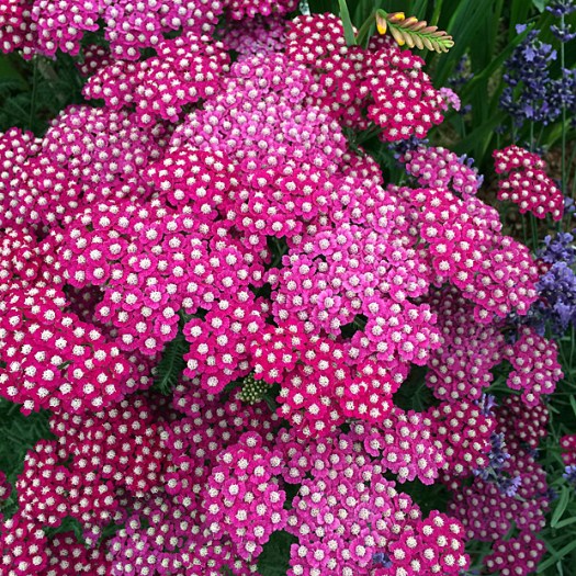
Great bouquet. I favour magenta
I see lots of magenta in there too.
Fushia?
Especially in the gladioli, I’d say.
I want that dahlia! What a bloom, and what a name! Surely all the above have at least a drop of black currant in them. Just as surely, naming colors is among writers’ and gardeners’ liveliest compulsions, but if the namer is a gardener-writer, then great energies are unleashed. Of course there is something to be said for Laurie’s suggestion to just go with “lovely.” Thanks for stirring up my Monday!
The dahlia has a definite flavouring of blackcurrant. I’m all for having fun and even poetic license with colours, but I’m still not convinced by violet for the first two. And while I’m being picky, most blue roses are decidedly purple.
I like the idea of wine names: Claret, Pinot Noir, Merlot, Shiraz, Cabernet Sauvignon, Rioja and so on and so on, I do like ‘Creme de Cassis’ for the Dahlia. I was thinking blackcurrant and cream before I reached the name. But as someone else pointed out they are all so lovely and there is so much fun in naming a colour 🙂
PS These are some of my favourite colours so I thank you for posting such gorgeous photos.
I’m glad you like the colour – in that case, consider these a belated birthday present. 🙂
Thank you! Much appreciated 🙂
Gorgeous colors! I have always loved the color “burgundy.”
In retrospect I was a bit cavalier in making the selection – the daylily is as burgundy as they come!
Of course you know I think they’re pink lol. I love those dahlias. Simply stunning. Lovely post.
Yes, I do!