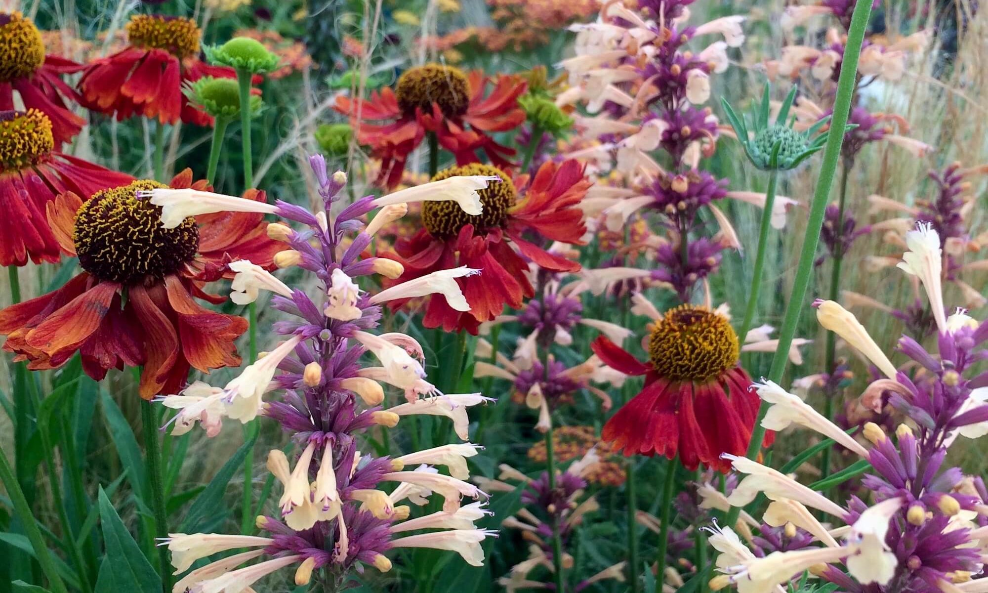
While visiting the flower shows this year, I was drawn to a colour thread represented by the flowers I’m showing here. I’d filed the pictures as Clarets thinking ‘Anyone for claret?’ would be a good post title, but reluctantly concluded that claret was stretching things too far…
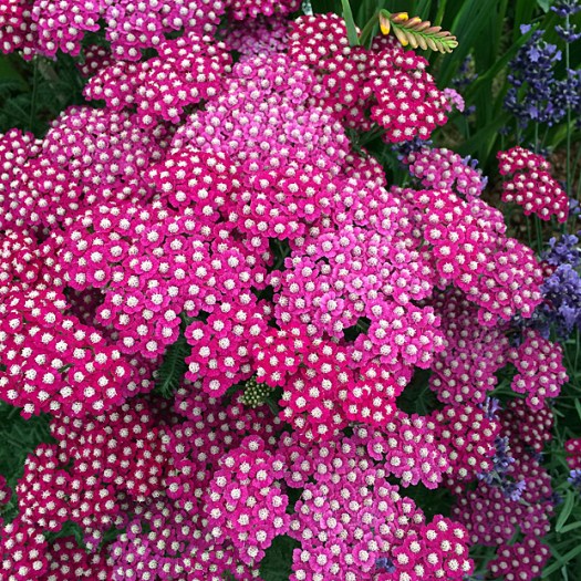
though not quite so far as the liberties taken in naming this ‘New Vintage Violet’…
or this ‘Dark Angel Violet’. Plant names are a minefield at the best of times, even before you add colour into the mix.

The bold combination of the daylily against the dusky foliage of an adjacent plant was so striking, I completely forgot to note down the variety names, but it looks like another violet to me – dark violet perhaps (only teasing).
It’s easy to mock, but more tricky to put your finger on what would be better: Pinot Noir, raspberry, fuchsia, pale crimson, magenta, burgundy… I could imagine objections to all of these. Professional help was required. Pantone, famous for their colour expertise, would have a name for the colour of these gladioli:
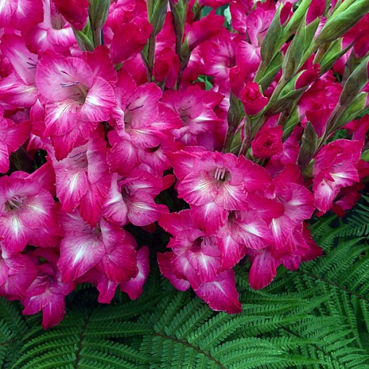
Problem solved. After consulting their site, I can confirm that, in the parlance of the day, these glads are Pink Peacock in hue. I don’t know if nature has given us any real pink peacocks, but Pantone asserts that the colour is tantalisingly theatrical, bold and experimental, and on trend.
Phew. I’ll leave you with a twist on the theme – a dahlia with pale upper petals as a beautiful contrast to their Pink Peacock reverses:
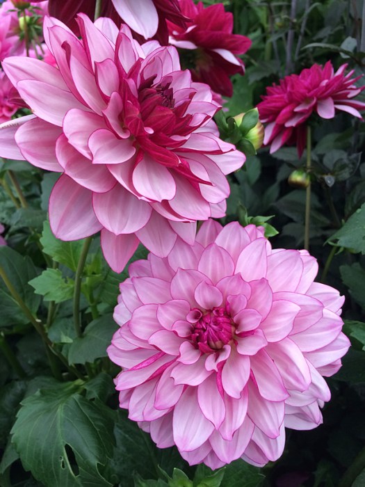
I love the picotee effect and the light waving or rippling of the petals that gives them a subtle light and shade effect.
So there you have it. A selection of perennials to create a modern twist on the classic red border.
We’ll soon start hearing about the colour Pantone has identified as the guiding light for designers during 2019. Assuming the corporate influences that gave us Pink Peacock will still be in play, I’m forecasting the colour of the year 2019 will be Unicorn. What do you think?

Having used PMS (Panatone Matching System) colors for years as a designer, I’ve only known them by their numbers. I don’t think Pantone gave them names in those days! I would use magenta or fuchsia for most of those flowers. Fun post!
I suppose it is helpful to name the ones they hope to get a little publicity with, Pink Peacock being more catchy than 18-2045 TCX!
So beautiful flowers and pictures!!!
I think I have just purchased one of the flowers you have mentioned as the “New Vintage Violet” – a dark purple yarrow. At my garden center it was called “New Vintage Red”. So I guess they keep coming up with new names for these new or old varieties and also have problems to decide what colour they are. 🙂
To me the colour of this flower looks like maroon or almost burgundy. It is very beautiful variety indeed. I also got “Strawberry Seduction” yarrow and this one looks in fact more strawberry-red , but has yellow center. Both are very nice and are supposed to grow not too big, so I hope they won’t need support.
There is a series of them, including red, rose, violet and white. The plants I saw seemed tidy and compact. I checked out ‘Strawberry Seduction’ online – it looks like you’ve made some great choices.
I feel pedestrian; I looked at these and thought “hot pink.” Peacock sounds so much more regal and exotic!
Peacock does have some great associations, you’re right. I don’t think I’d have come up with that one either.
This is such a girly topic! Men can not see as many colors! I know this from growing rhododendrons! I sometimes needed to ask my neighbor about colors. She knows them all. I still do not know what the most popular colors of bougainvillea are.
I was half-imagining your response as I was writing this. I’ve known quite a few male colour mixers, shaders and designers, especially in my wallpaper days, but statistically you’re right, men are more likely to have some form of colour blindness. It is fascinating to wonder how other people perceive colour and also to think about those who have synesthesea and associate colours with words or sensations.
Ha! Am I that predictable?
Shall we say consistent?
Ah, good euphemism.
Is hot pink too obvious?
It’s a popular suggestion! Almost every flower has a variety of colours and I think I was linking them by their darkest parts.
I think the color is properly Fuchsia. Beautiful!
You’ve reminded me of seeing displays of many different colours of fuchsias at flower shows. It always makes me smile when the colour of a rose is described as ‘pure rose pink’ as if there was only one colour, even though I sometimes do it myself. I suppose we associate the name of a colour with a particular shade, though we’d be hard placed to explain how the association came to be. With fuchsia, perhaps it is related to the ones we most commonly see growing wild.
They are all beautiful, but I think I like Dahlia ‘Creme de Cassis’ the best. I love that colour, whatever it is.
The dahlia stood out for me too, even though it was with a lot of other varieties and wasn’t the flashiest or largest.
These are all stunning colours. I love them all. 🌼
Cerise.