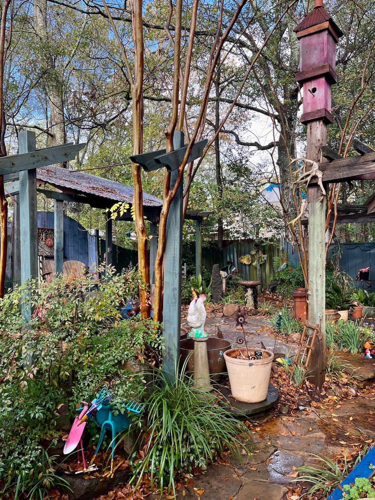
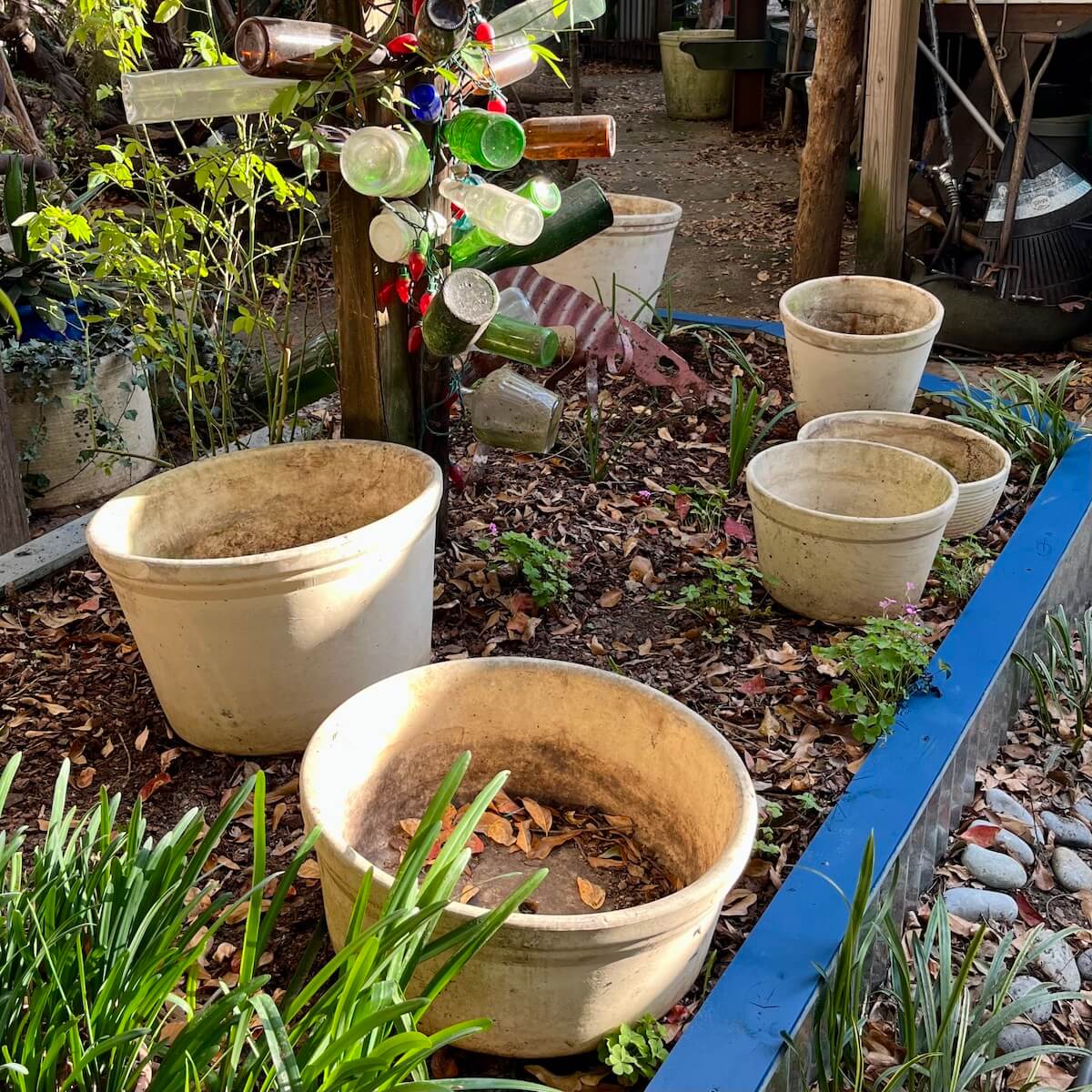
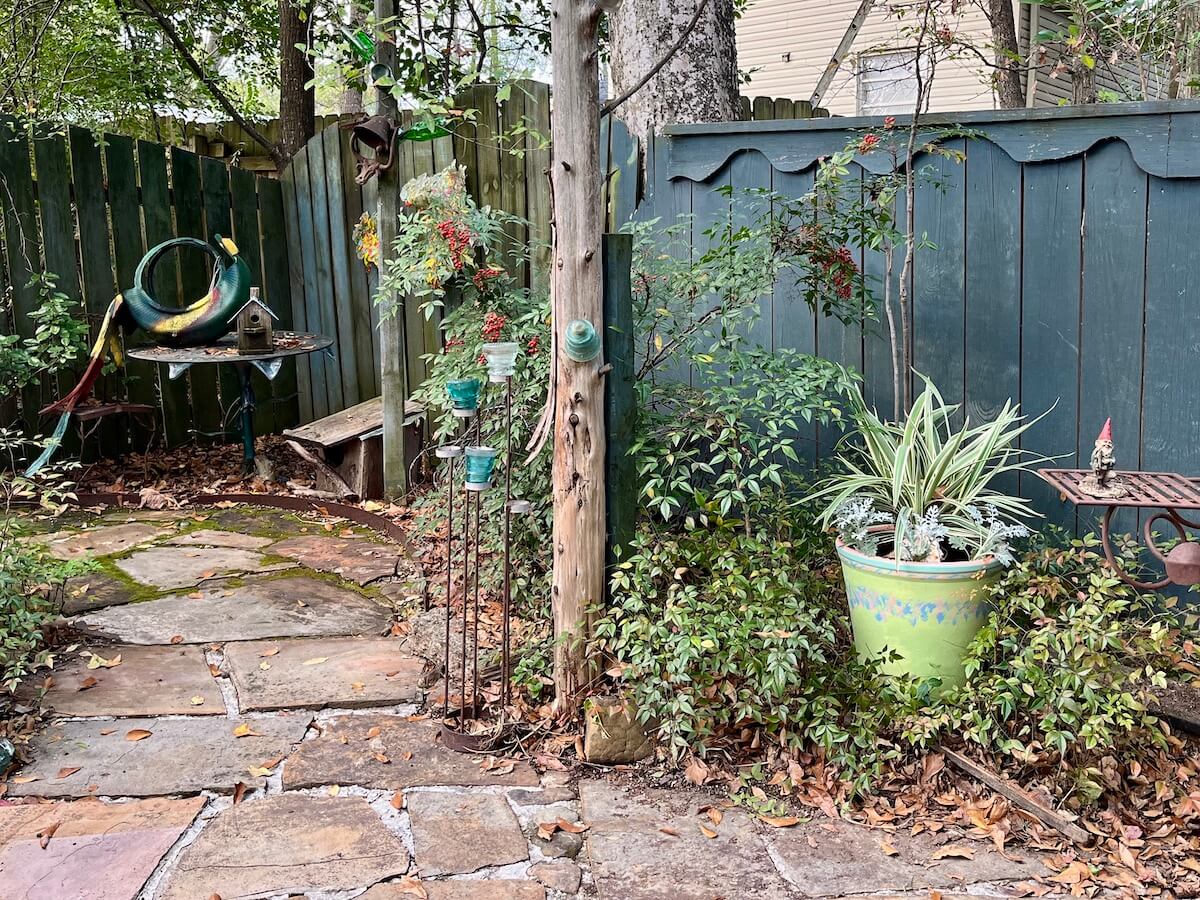
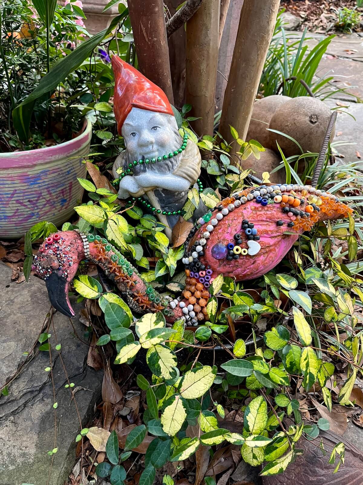
My sweetheart, who rarely does things by half, bought a job lot of creamy-white clay pots at wholesale prices decades ago. Most survive. Some are huge, others, squat; all are big enough to hold several plants. Over the years, they have been not exactly hidden, but tucked as out of the way as such a collection can be in a smallish garden. You can spot one in the top picture beside Granny’s chicken and another in the background.
To tell you the truth, I have never much liked them. Yes, I know they are potentially very useful, dramatic by the standards of your average pot and even stackable, but their colour predominates. Their weathering errs on the scruffy side of interesting; the largest ones are virtually immovable; and the odd one is more chasmed than cracked.
Recently he told me of his plans to scatter them on a raised bed and around a trough-style water feature in the back yard. An assortment of prized hardy mums (Chrysanthemum x rubellum) were destined for the raised bed. The pots could add height over their colourful sprawl in the fall and be planted with spring bulbs to take over while the mums were resting.
I (rashly, as it turned out) suggested it might be better to paint them first. On full display, their utilitarian style would work against the quirkiness of the yard. Painted, they could make up for the relative lack of flowers and brighten up the garden.
“OK, then,” he said, “but you’ll have to do it, and I need it doing quickly.”
I am no painter, so I dragged my feet. After a day or so, it became clear I’d have to make a start or make my peace with the cream monsters moving in.
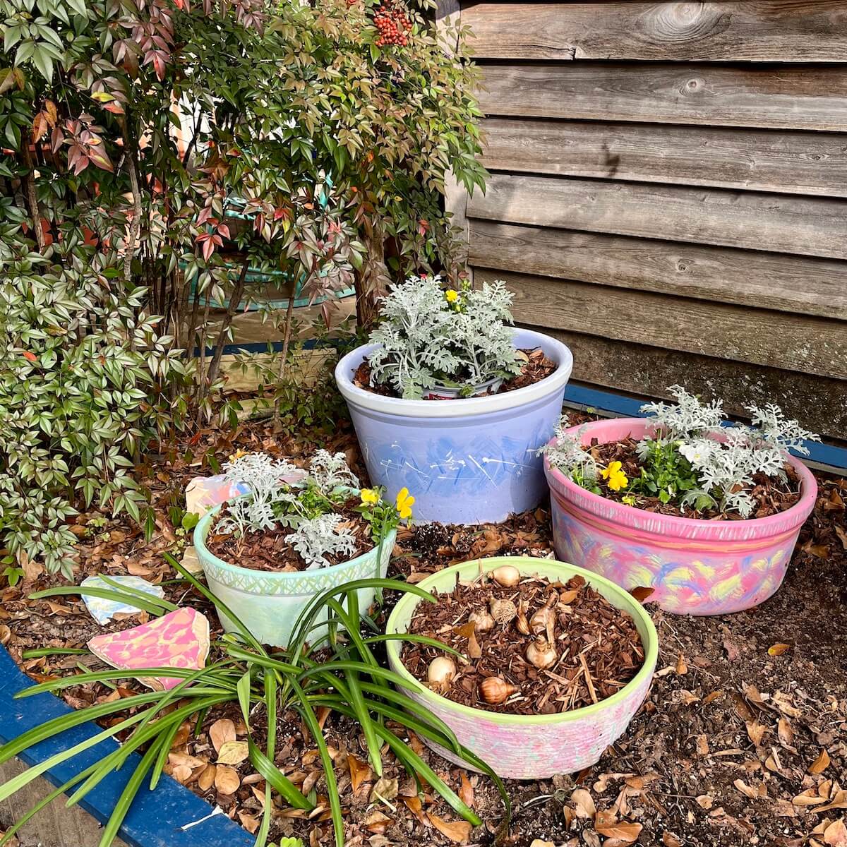
As they already had. Felder had picked out eight of the middling-sized pots that could be be clustered together and re-sited to suit the seasons. They were ready for planting, with or without paint.
In my favour were low expectations (what would it take to make the pots look significantly worse, to my eyes?), and a willingness to have a go. Or, make that, a sweetheart with a habit of empowering people and his determination that I’d have a go.
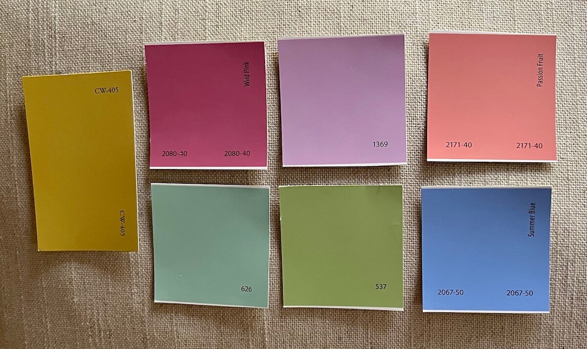
I wanted a palette of several colours, so abandoned the idea of using a rather pricey limewash range, and went for Benjamin Moore paint in sample sizes that could be mixed while we waited.
Although the interiors colours I’d chosen were not recommended for outside, the shop assistant explained he’d used a sample to paint a pot that had been outside for ten years or more and still looked pretty decent. That was good enough for me.
Being water-based, the paint could be thinned with water and washed out in a crisis.
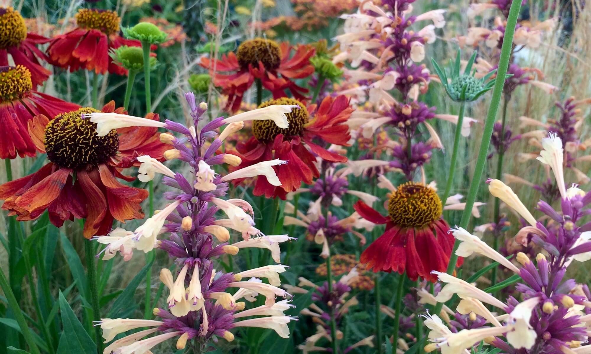
I still had no real idea what I was going to do in terms of patterns other than a few basic principles: distressed textures, drip effects and bold colours, though not eye-pokingly so. The pots should be as colourful as flowers in a shady area that often lacked them.
I made various rookie (I’ll cut myself some slack and not say ‘errors’) misunderstandings. If you can make a misunderstanding, which you really can’t.
The first surprise was that the paint was quite thick, so it was much easier to cover the pot well than patchily, which I’d anticipated doing. I ended up thinning them a little with water when laying down the base coats, but appreciating the opacity.
Once I started painting, the layered colour combinations and border-on-top-of-border effects came quite naturally. I rolled the first patterns and techniques I came up with through, in different ways, on to some of the other pots, to give the feeling that they did have some connection to each other.
As planned, I thickly painted a band around the top of one pot to create drip effects, but it dripped too well – all the way down the pot – so after a while spent trying to refine it, I conceded defeat and painted over it. A gloss paint might have worked better for this.
Meanwhile, my sweetheart kept well out of the way. When he did pass by, he was encouraging, if a little surprised, as the pots turned out to have little bearing on the few references I’d persuaded him to look over beforehand.
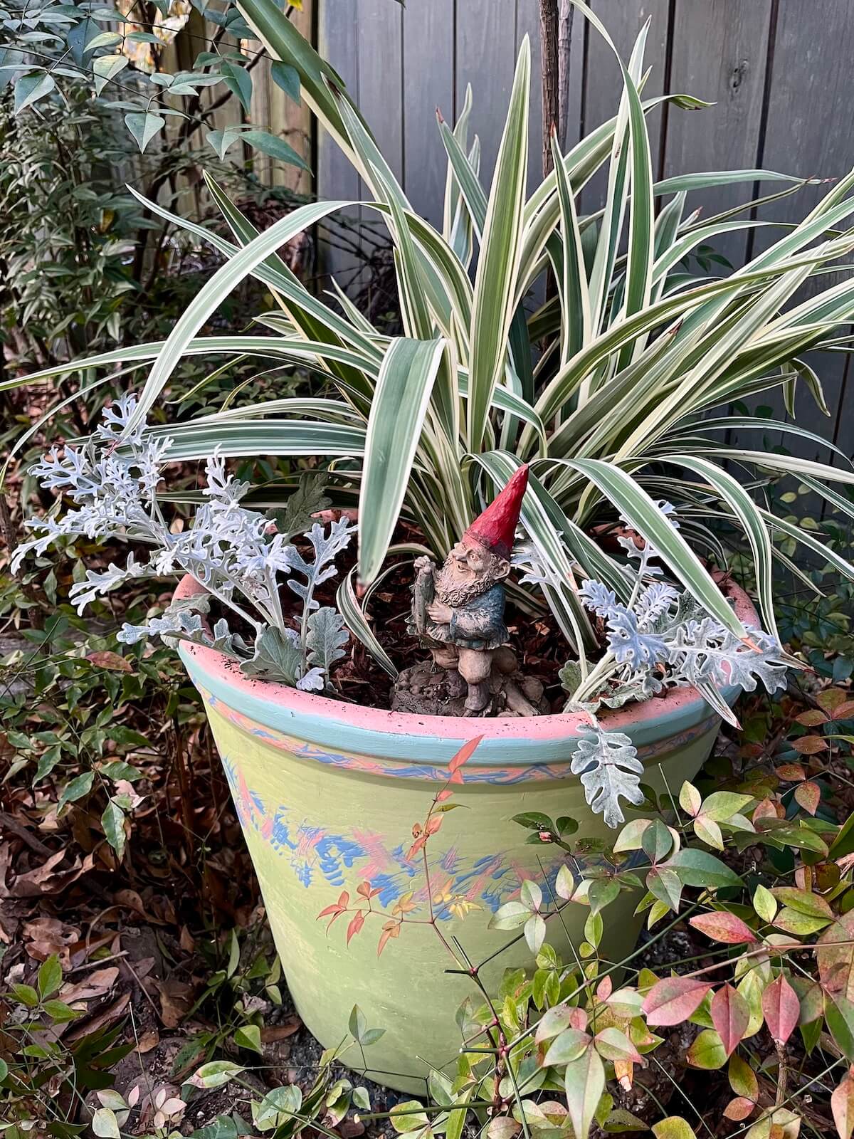
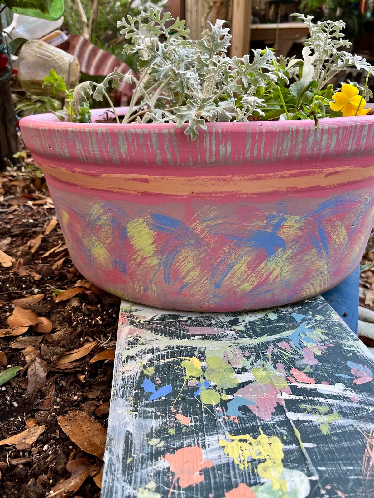
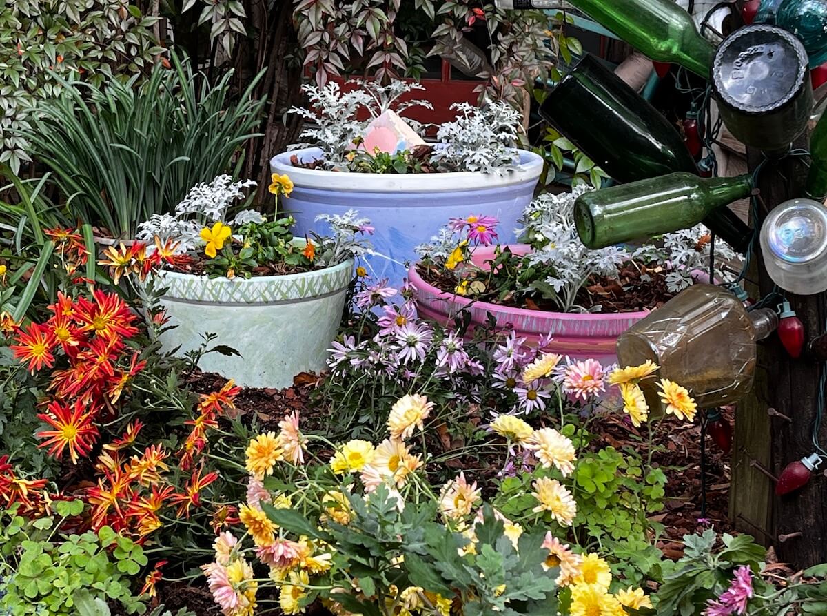
I continued painting the pots well after they were theoretically finished, having dreamed up little ‘improvements’. A ring of yellow underneath the pot rim brightened the textured green pot (above, left, compared to below). Eagle-eyed readers may have spotted that I went with a purer yellow than the paint chip I’d laid out on the cushion.
From hints, I gathered that Felder thought the mauve pot was a bit blah-looking after my first attempt. I hadn’t been sure how wild I should go given that he’d liked the plain cream versions and at that stage I had only bought a few colours.
After layering on bolder sweeps of some new colours, I gaily painted a turquoise pattern around the rim then added a too broad, unsteady orange band that created a even dodgier colour clash and unbalanced the pattern. The more I tried to even up the band, the broader it got.
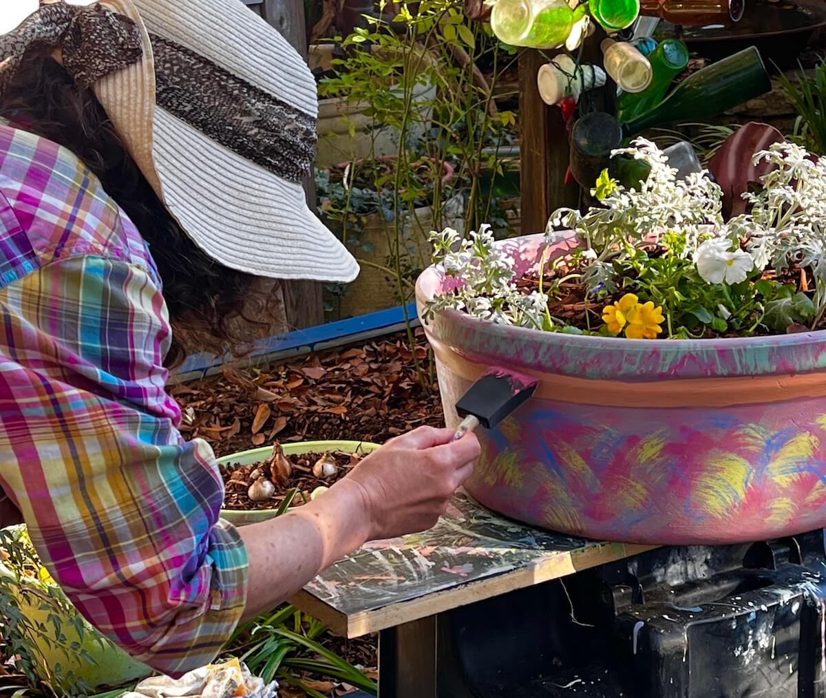
By now I felt out of my depth and seriously doubted I could redeem this, so went for a cup of coffee and a sit down before heading back for another go. A deep pink patchily applied along the top and bottom of the band brought it back into proportion and I used the same colour to tone down the turquoise.
This is one of my favourites because when I look at it, I remember that moment of doubt so it makes me smile that it turned out as well as it has. But then I’m easily pleased – I’d also liked the subtle version I’d overpainted and several of the versions in between!
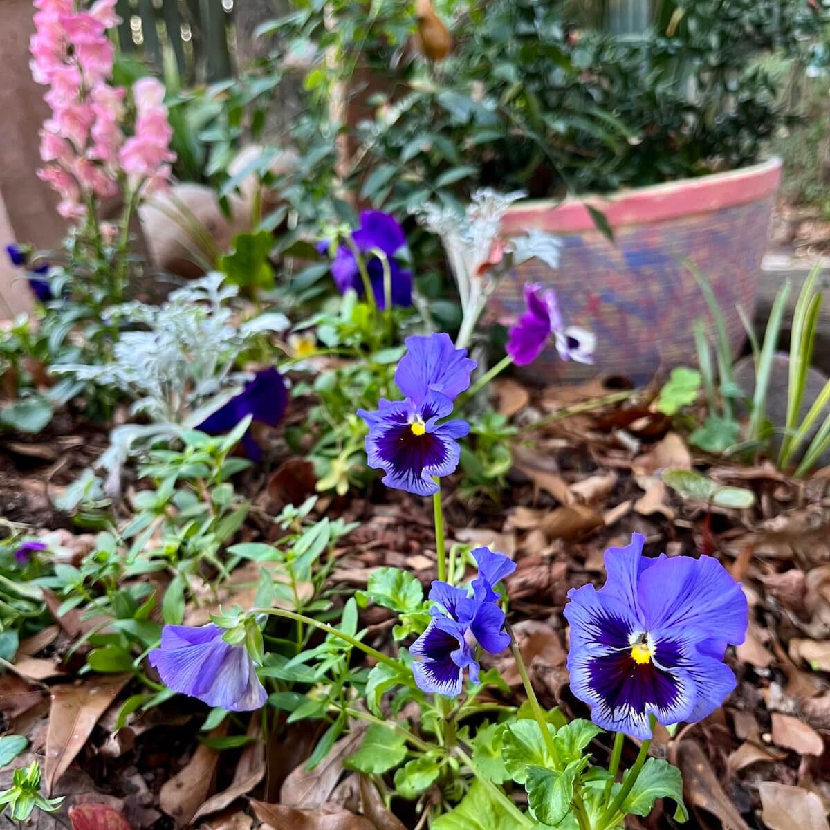
Another pot which was basically yellow needed scratchily jazzing up while it was in place. (Don’t ask me why. It seemed to make sense at the time.) As a result one side is yellower, to sit with some variegated foliage and the other is bluer, to suit the pansies. A hidden expanse of pot remains yellow. Now that’s a one off.
I naively set out to splash white paint along a narrow band on an already planted pot (below, rear) without anticipating collateral damage. I remember watching (in the slow motion that mild horror induces) the paint leaving the brush in a completely different direction to the one I’d anticipated, then trying again and seeing much the same thing. That was, as my sweetheart often says, a good bad idea (or a bad good idea. I have never worked out the difference.)
Somehow enough did eventually splash on the pot to satisfy me. Thanks are due to Felder for helping me clean up!
You may marvel at my temerity but I’m going to share some tips which you should skip if you already know how to do this.
15 tips for painting pots
- You don’t need to believe you can do this to make a very decent attempt. I wasn’t confident at all. Feeling secretly scared to ‘ruin’ a good pot adds to the thrill.
- If you’re going to the trouble of painting pots, you might as well aim to make something you couldn’t buy.
- Sample-sized paints are an economical way to have several colours on the go. I compromised on the finish and lifetime outdoors to use a broad range of interiors colours, but have no regrets. They look fine up close and I’ll happily re-paint when needed.
- Test out colour combinations and techniques unless you can see the outcome in your mind’s eye. Pieces of broken pot found hiding beside the compost bins made great testers, and the board used to balance the pots on an upturned wheelie bin ended up highly decorated too.
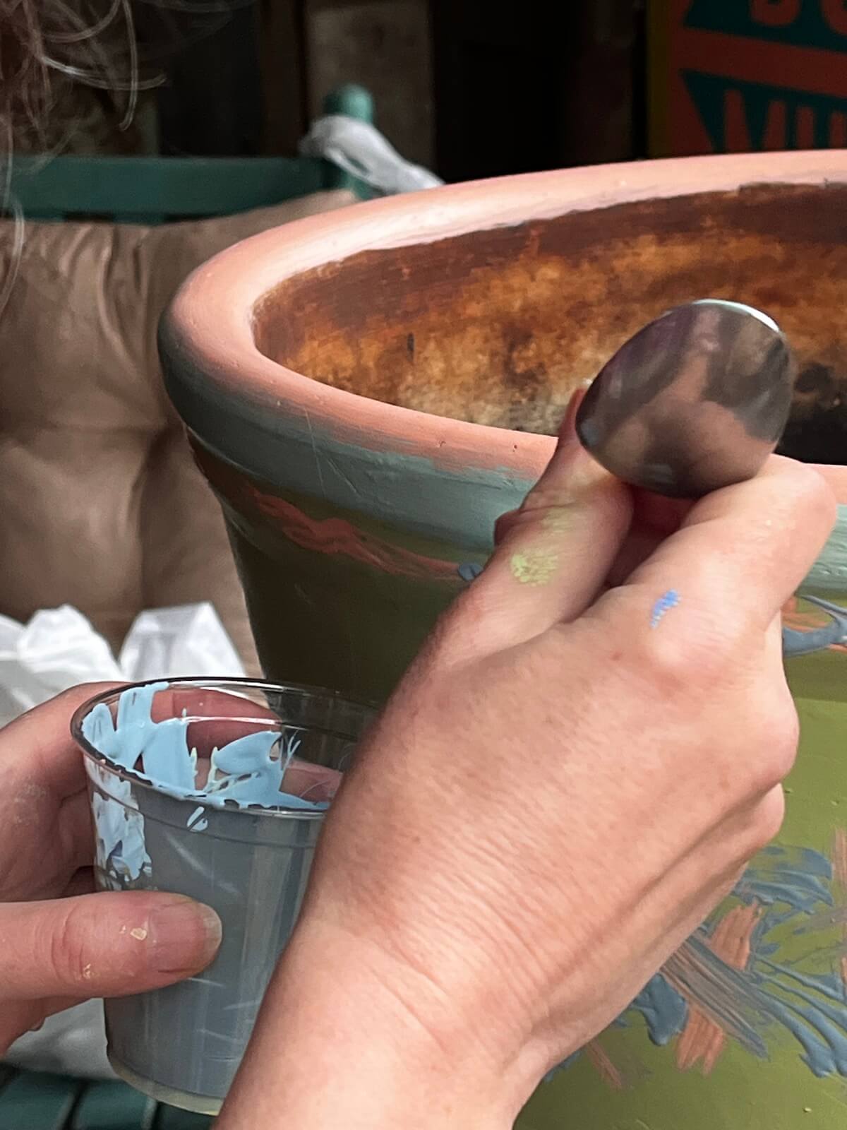
- Use any tool that will get the paint on the pot in a manner you like. Experiment and don’t think you need to spend a fortune. I had a few cheap brushes, including flat, spongy ones, and plenty of old rags, but the colour details on the pot that everyone seems to like best were applied with the tines of a fork and the handle of a teaspoon that allowed me to create cleaner, more textural details.
- The trick is to plan enough (but not too much), then be really adaptable once you start working and discover how the paint responds to the pot surface.
- Let the weather help you. On a warm November day (in Mississippi), the paint dried to the touch quickly and made it easy to layer colours. Finishing off on a much cooler day, towards the edge of the paint’s drying limits, I had to hold back.

- Highlight any features the pots have, such as rims or, if you’re lucky, handles. Contrasting colours will accentuate a double or triple rim.
- I found it much easier to paint pots with a smooth surface compared to some textured ones we had with lots of narrow ridges around them.
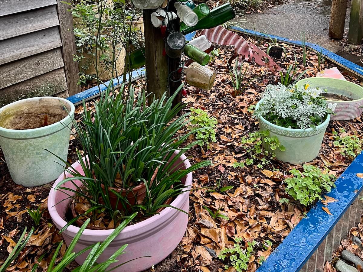
- Remember that the pots will be seen at angles from above. I painted a broad top band inside most of the pots, so that when planted, there is a glow around the foliage, rather than the grubby, creamy-white surface I started off with.
- Like pruning a rose, do a bit, then step back, walk around and reassess.
- When layering and patching colours, my instinct was to conceal which colour was added last, by going back to add balancing touches of earlier colours here and there. It just seemed to look better.
- Splashing paint is reckless. If you must splash, practice first. Protect yourself and everything else. It’s most likely easier splashing an empty pot, turned on its side, from above rather than going at a planted one from the side.
- Don’t panic if you stray down the wrong path. (Metaphorically, that is. If the actual paint strays down the path, a swift response helps.) Take a break. Wipe the offending part off if you can, or leave to dry and repaint.
- You may like to apply a breathable sealer as a final stage. I didn’t.
- Knowing when to stop is the hardest part. Not just with each individual design, but also when you have plenty of paint left and are on a roll. After all eight were done, Felder caught me on the prowl with a paintbrush held hopefully in one hand, eyeing up several other pots, including some terracotta ones displayed on shelves. He steered me away. Very wise.
Bonus tips on choosing colours
- For this project, aim to make a miniature ‘paint card’ where the colours all play nicely together.
- Gather inspiration: pictures of the garden; pins or screen shots of pots, both planted and unplanted; a favourite scarf or object of desire (I had some retro-style mugs vaguely in mind), then convert them into paint colour chips.
- Check that you can sit any 2, 3 or 4 of the chips alongside each other and be happy with the effect.
- You’ll most likely colour-mix during the process, but don’t imagine you need to start off with prime colours, plus white and black.
- A half-way house of ready-mixed colours, used neat or thinned provides a safe start.
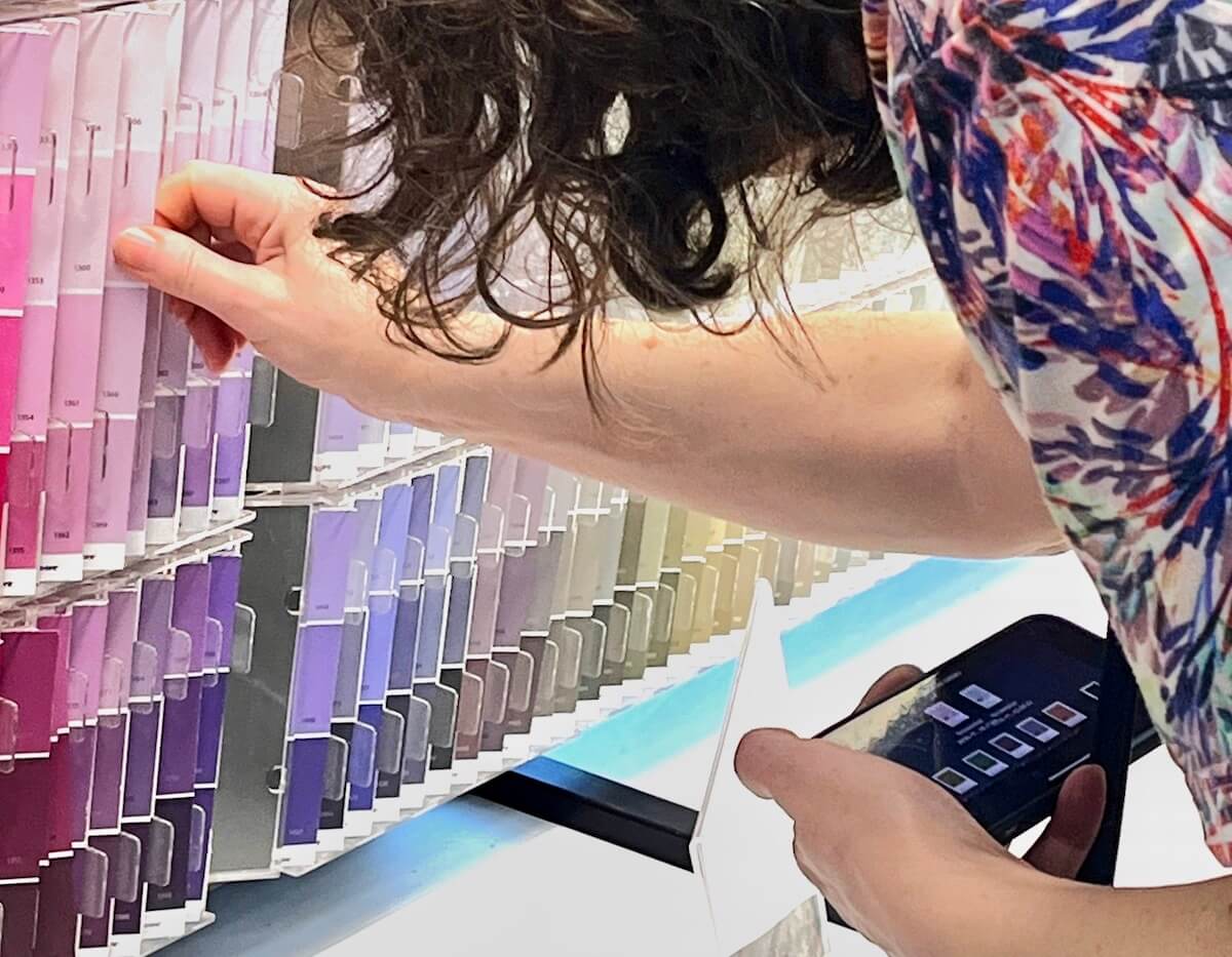
- If you are unsure which shades to choose from paint strips, pick deeper ones. It’s a moment’s work to add a touch of white to edge them lighter.
- Go gently when mixing because the more wildly you mix, the muddier your colours will be, especially if you’re combining premixed shades that already have red, yellow and blue in them. Try a little before doing a lot, unless you have a lust for dull mauves and muddy browns.
This is the part of any painting project that my sweetheart hates to witness. He claims it took three months for me to choose a door colour (not true!)
I’ll leave you with this thought:
“A back yard ought to be a carnival”
– Rick Griffin, Landscape Architect

Susan, a really inspirational and informative post. I never really had thought of pot painting, but already have an idea of how to spruce up a pot (or more!) from this. I don’t know if our back yard will ever resemble a carnival, but our pots surely can. Nice to see a new post here!
That’s lovely to hear. Most how-to posts are written by experts who know what they’re doing and are confident in their ability. You’ll have realised this shatters that mould. On the plus side, I am convinced that if I can do it, anyone can.
I’m impressed, they turned out very nicely!
Thanks, Eliza. The best thing is you can paint them however you like and do it over again if you change your mind.
What absolutely delightful entertainment you just provided me. I have no intention of attempting the same as I’m sure my results would be woeful and patience and understanding are not my beloved’s strong points. I wish I was nearer so you could invite me round for a look. Happy New Year xx
I’d love that too. He hadn’t planned on them being painted, but eventually decided it might be good for me to have a creative project (or that is how I interpret it). Now he’s telling anyone who’ll listen that I’ve been ‘girling up’ his yard.
You could 100% do it, if you ever got the urge. It may seem high risk, but it is very low risk! Happy New Year to you and yours!
You really did a great job with lots of colors and designs.
Thank you! For those of us who enjoy patterns, colours and gardens, this is a perfect project.
What a fun project! I loved all the detail about your approach to each pot, following through to the end results. I would never have thought to do this, but now I’m thinking….
Take your time and enjoy the experience. It’s soon over and then you’ll be marauding around like me, looking for new pots to paint.
You have such an eye for photographing other people’s gardens it was lovely to have a tour round your own. My first thought at the beginning of the post was ‘paint them’, but I had no idea how well you would have carried this out. Certainly a ‘carnival’ effect. Very well done, Susan
Thanks, Derrick. I’m glad you were of my way of thinking. I like playing around with colours, but I had almost no idea what patterns were going to emerge when I started.
Very creative.
It was fun to do – especially afterwards, looking back.
Really lovely results and a great post. These would certainly liven up a winter garden! 😃 Thanks for sharing Susan!
My pleasure. I’m glad you liked them. Weirdly, while they are colourful, they seem to stand out less than they did before, which is what I was hoping for.
Thanks – useful to know that indoor paint works fine for this sort of project
It’s too early to know how quickly they will weather or fade, but I wasn’t aiming for perfection. I tend to like weathered colours, and if these prove an exception, I’ll just have another go.
Worth a try anyway!
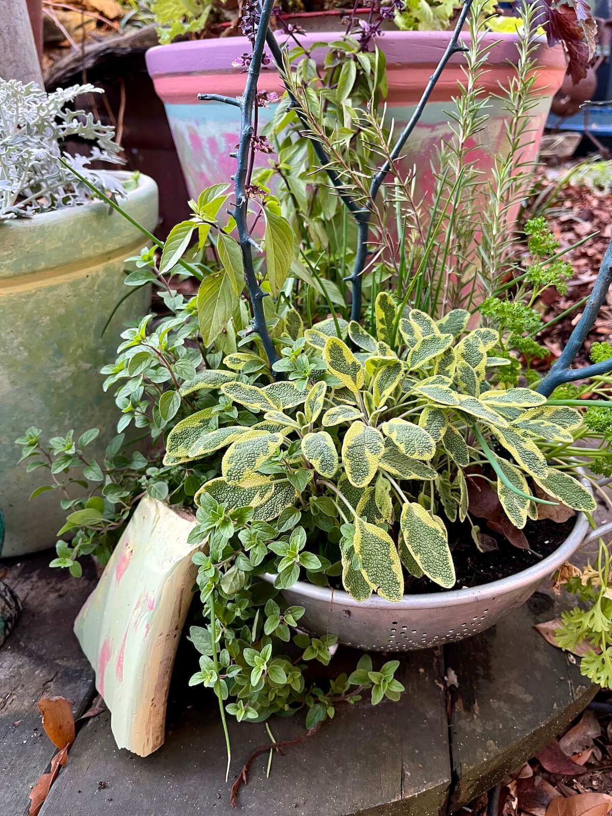
It’s so good to find you here, even though I’m a bit late with the find! I loved the whole process and the many laughs. This last photo, so chockablock with color, is enough to make all of us rush out for brushes and paints, especially since some of us are trapped in the drabs of winter. It’s wonderful to be reminded of the busyness of gardens. I couldn’t help noticing, by the way, that you seem to have maybe sage and rosemary planted in my grandma’s colander! Imagine that! (Exactly so, Maureen!)
You could never be too late for any party – it would start up all over again when you arrived. And, yes, there’s a whole herb garden in that colander – and great drainage too.
These are delightful!